Note
Go to the end to download the full example code.
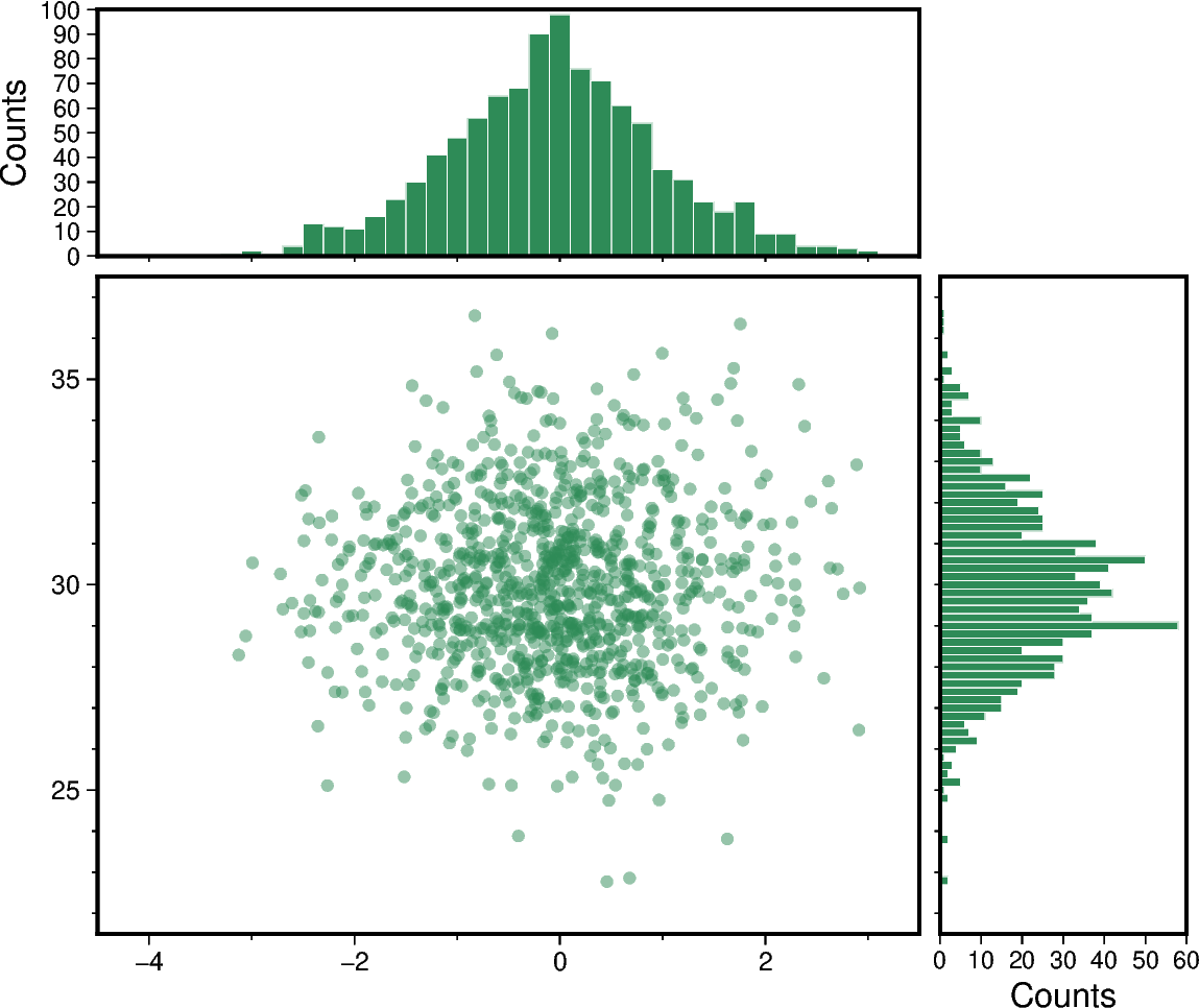
Scatter plot with histograms
To create a scatter plot with histograms at the sides of the plot one can use
pygmt.Figure.plot in combination with pygmt.Figure.histogram. The
positions of the histograms are plotted by offsetting them from the main scatter plot
using pygmt.Figure.shift_origin.
import numpy as np
import pygmt

# Generate random x-, y-coordinates from a standard normal distribution.
# x-values are centered on 0 with a standard deviation of 1, and y-values are centered
# on 30 with a standard deviation of 2.
rng = np.random.default_rng()
x = rng.normal(loc=0, scale=1, size=1000)
y = rng.normal(loc=30, scale=2, size=1000)

# Get axis limits from the data limits. Extend the limits by 0.5 to add some margin.
xmin = np.floor(x.min()) - 0.5
xmax = np.ceil(x.max()) + 0.5
ymin = np.floor(y.min()) - 0.5
ymax = np.ceil(y.max()) + 0.5

# Set fill color for symbols and bars.
fill = "seagreen"

# Set the dimensions of the scatter plot.
width, height = 10, 8

fig = pygmt.Figure()
fig.basemap(
    region=[xmin, xmax, ymin, ymax],
    projection=f"X{width}/{height}",
    frame=["WSrt", "af"],
)

# Plot data points as circles with a diameter of 0.15 centimeters and set transparency
# level for all circles to deal with overplotting.
fig.plot(x=x, y=y, style="c0.15c", fill=fill, transparency=50)

# Shift the plot origin in y-direction temporarily and add top margin histogram.
with fig.shift_origin(yshift=height + 0.25):
    fig.histogram(
        projection=f"X{width}/3",
        frame=["Wsrt", "xf", "yaf+lCounts"],
        # Give the same value for ymin and ymax to have them calculated automatically.
        region=[xmin, xmax, 0, 0],
        data=x,
        fill=fill,
        pen="0.1p,white",
        histtype=0,
        series=0.2,
    )

# Shift the plot origin in x-direction temporarily and add right margin histogram.
with fig.shift_origin(xshift=width + 0.25):
    # Plot the horizontal histogram.
    fig.histogram(
        horizontal=True,
        projection=f"X3/{height}",
        # Note that the x- and y-axes are flipped, with the y-axis plotted horizontally.
        frame=["wSrt", "xf", "yaf+lCounts"],
        region=[ymin, ymax, 0, 0],
        data=y,
        fill=fill,
        pen="0.1p,white",
        histtype=0,
        series=0.2,
    )
fig.show()
Total running time of the script: (0 minutes 0.270 seconds)