Note
Go to the end to download the full example code.
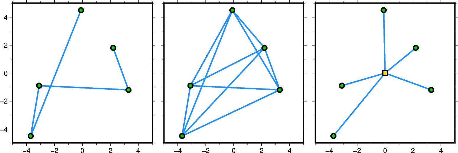
Connection lines
The connection parameter of the pygmt.Figure.plot method allows to plot
connection lines between a set of data points. Width, color, and style of the lines
can be adjusted via the pen parameter. The data points must be plotted separately
using the style parameter, with adjustments for the symbol fill and outline via
the fill and pen parameters, respectively.
import pygmt
from pygmt.params import Axis, Frame

# Set up same sample data
x = [2.2, 3.3, -3.1, -3.7, -0.1]
y = [1.8, -1.2, -0.9, -4.5, 4.5]

# Create new Figure instance
fig = pygmt.Figure()

# -----------------------------------------------------------------------------
# Left: record order
fig.basemap(
    region=[-5, 5, -5, 5],
    projection="X6c",
    frame=Frame(axes="WSne", axis=Axis(annot=True, tick=True)),
)

# Connect data points based on the record order [Default connection=None]
fig.plot(x=x, y=y, pen="1.5p,dodgerblue")
# Plot data points
fig.plot(x=x, y=y, style="c0.2c", fill="green3", pen="1.5p")

fig.shift_origin(xshift="w+0.5c")

# -----------------------------------------------------------------------------
# Middle: network
fig.basemap(
    region=[-5, 5, -5, 5],
    projection="X6c",
    frame=Frame(axes="wSne", axis=Axis(annot=True, tick=True)),
)

# Connect data points as network
fig.plot(x=x, y=y, pen="1.5p,dodgerblue", connection="n")
# Plot data points
fig.plot(x=x, y=y, style="c0.2c", fill="green3", pen="1.5p")

fig.shift_origin(xshift="w+0.5c")

# -----------------------------------------------------------------------------
# Right: reference point
fig.basemap(
    region=[-5, 5, -5, 5],
    projection="X6c",
    frame=Frame(axes="wSne", axis=Axis(annot=True, tick=True)),
)

# Connect data points with the reference point (0,0)
fig.plot(x=x, y=y, pen="1.5p,dodgerblue", connection="p0/0")
# Plot data points
fig.plot(x=x, y=y, style="c0.2c", fill="green3", pen="1.5p")
# Plot reference point
fig.plot(x=0, y=0, style="s0.3c", fill="gold", pen="1.5p")

fig.show()
Total running time of the script: (0 minutes 0.159 seconds)