Note
Click here to download the full example code
Plotting datetime charts
PyGMT accepts a variety of datetime objects to plot data and create charts.
Aside from the built-in Python datetime object, PyGMT supports input using
ISO formatted strings, pandas, xarray, as well as numpy.
These data types can be used to plot specific points as well as get
passed into the region parameter to create a range of the data on an axis.
The following examples will demonstrate how to create plots using the different datetime objects.
import datetime

import numpy as np
import pandas as pd
import pygmt
import xarray as xr
Using Python’s datetime
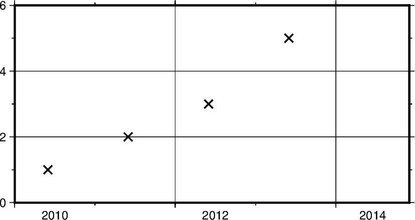
In this example, Python’s built-in datetime module is used
to create data points stored in list x. Additionally,
dates are passed into the region parameter in the format
(x_start, x_end, y_start, y_end),
where the date range is plotted on the x-axis.
An additional notable parameter is style, where it’s specified
that data points are to be plotted in an X shape with a size
of 0.3 centimeters.
x = [
    datetime.date(2010, 6, 1),
    datetime.date(2011, 6, 1),
    datetime.date(2012, 6, 1),
    datetime.date(2013, 6, 1),
]
y = [1, 2, 3, 5]

fig = pygmt.Figure()
fig.plot(
    projection="X10c/5c",
    region=[datetime.date(2010, 1, 1), datetime.date(2014, 12, 1), 0, 6],
    frame=["WSen", "afg"],
    x=x,
    y=y,
    style="x0.3c",
    pen="1p",
)
fig.show()
Out:
<IPython.core.display.Image object>
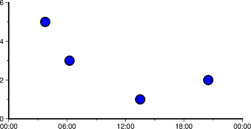
In addition to specifying the date, datetime supports
the exact time at which the data points were recorded. Using datetime.datetime
the region parameter as well as data points can be created
with both date and time information.
Some notable differences to the previous example include
Modifying
frameto only include West (left) and South (bottom) borders, and removing grid linesUsing circles to plot data points defined through
cinstyleparameter
x = [
    datetime.datetime(2021, 1, 1, 3, 45, 1),
    datetime.datetime(2021, 1, 1, 6, 15, 1),
    datetime.datetime(2021, 1, 1, 13, 30, 1),
    datetime.datetime(2021, 1, 1, 20, 30, 1),
]
y = [5, 3, 1, 2]

fig = pygmt.Figure()
fig.plot(
    projection="X10c/5c",
    region=[
        datetime.datetime(2021, 1, 1, 0, 0, 0),
        datetime.datetime(2021, 1, 2, 0, 0, 0),
        0,
        6,
    ],
    frame=["WS", "af"],
    x=x,
    y=y,
    style="c0.4c",
    pen="1p",
    color="blue",
)
fig.show()
Out:
<IPython.core.display.Image object>
Using ISO Format
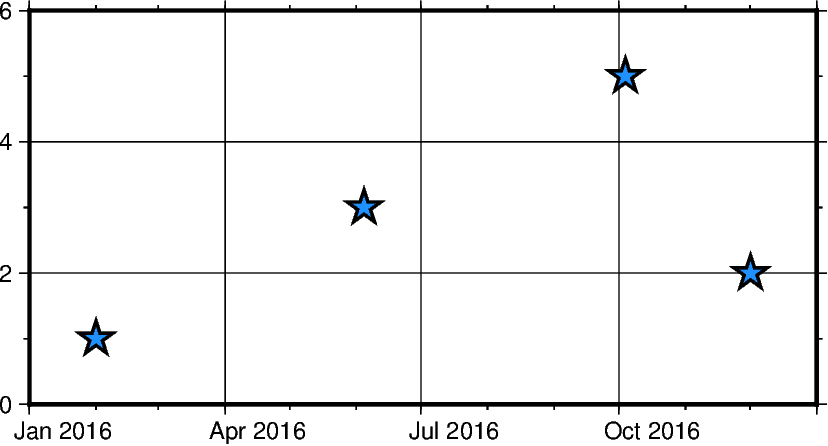
In addition to Python’s datetime library, PyGMT also supports passing times
in ISO format. Basic ISO strings are formatted as YYYY-MM-DD
with each - delineated section marking the four digit year value, two digit
month value, and two digit day value respectively.
When including time of day into ISO strings, the T character is used, as
can be seen in the following example. This character is immediately followed
by a string formatted as hh:mm:ss where each : delineated section marking
the two digit hour value, two digit minute value, and two digit second value
respectively. The figure in the following example is plotted over a horizontal
range of one year from 1/1/2016 to 1/1/2017.
Out:
<IPython.core.display.Image object>
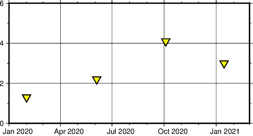
Mixing and matching Python datetime and ISO dates
The following example provides context on how both datetime and ISO
date data can be plotted using PyGMT. This can be helpful when dates and times
are coming from different sources, meaning conversions do not need to take place
between ISO and datetime in order to create valid plots.
x = ["2020-02-01", "2020-06-04", "2020-10-04", datetime.datetime(2021, 1, 15)]
y = [1.3, 2.2, 4.1, 3]
fig = pygmt.Figure()
fig.plot(
    projection="X10c/5c",
    region=[datetime.datetime(2020, 1, 1), datetime.datetime(2021, 3, 1), 0, 6],
    frame=["WSen", "afg"],
    x=x,
    y=y,
    style="i0.4c",
    pen="1p",
    color="yellow",
)
fig.show()
Out:
<IPython.core.display.Image object>
Using pandas.date_range
In the following example, pandas.date_range produces a list of
pandas.DatetimeIndex objects, which gets is used to pass date
data to the PyGMT figure.
Specifically x contains 7 different pandas.DatetimeIndex objects, with the
number being manipulated by the periods parameter. Each period begins at the start
of a business quarter as denoted by BQS when passed to the periods parameter. The inital
date is the first argument that is passed to pandas.date_range and it marks the first
data point in the list x that will be plotted.
x = pd.date_range("2018-03-01", periods=7, freq="BQS")
y = [4, 5, 6, 8, 6, 3, 5]

fig = pygmt.Figure()
fig.plot(
    projection="X10c/10c",
    region=[datetime.datetime(2017, 12, 31), datetime.datetime(2019, 12, 31), 0, 10],
    frame=["WSen", "ag"],
    x=x,
    y=y,
    style="i0.4c",
    pen="1p",
    color="purple",
)
fig.show()
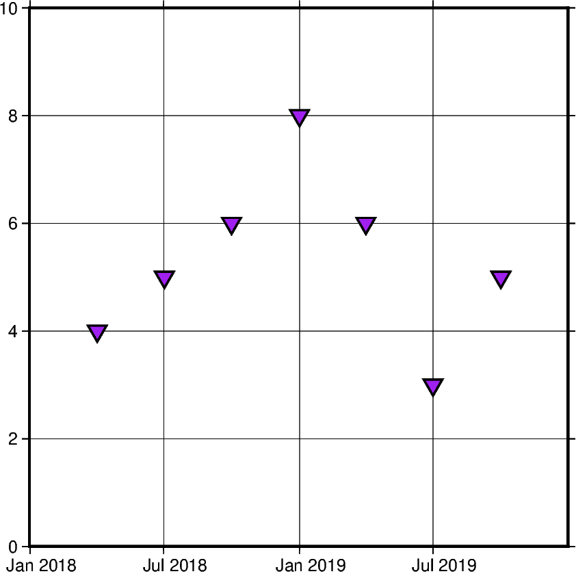
Out:
<IPython.core.display.Image object>
Using xarray.DataArray
In this example, instead of using a pandas.date_range, x is initialized
as a list of xarray.DataArray objects. This object provides a wrapper around
regular PyData formats. It also allows the data to have labeled dimensions
while supporting operations that use various pieces of metadata.The following
code uses pandas.date_range object to fill the DataArray with data,
but this is not essential for the creation of a valid DataArray.
x = xr.DataArray(data=pd.date_range(start="2020-01-01", periods=4, freq="Q"))
y = [4, 7, 5, 6]

fig = pygmt.Figure()
fig.plot(
    projection="X10c/10c",
    region=[datetime.datetime(2020, 1, 1), datetime.datetime(2021, 4, 1), 0, 10],
    frame=["WSen", "ag"],
    x=x,
    y=y,
    style="n0.4c",
    pen="1p",
    color="red",
)
fig.show()
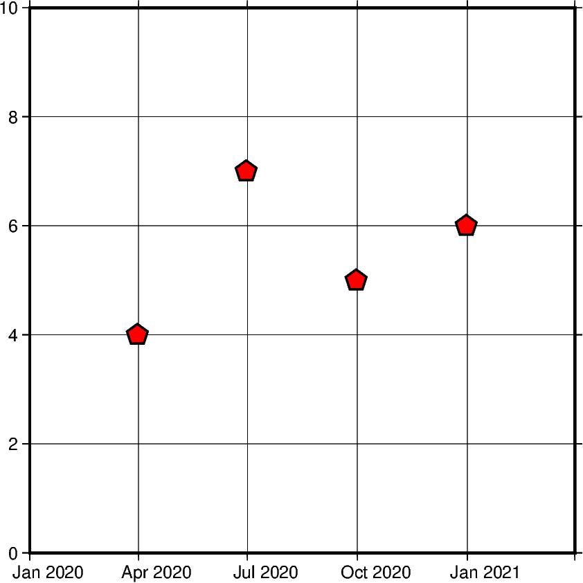
Out:
<IPython.core.display.Image object>
Using numpy.datetime64
In this example, instead of using a pd.date_range, x is initialized
as an np.array object. Similar to xarray.DataArray this wraps the
dataset before passing it as a paramater. However, np.array objects use less
memory and allow developers to specify datatypes.
x = np.array(["2010-06-01", "2011-06-01T12", "2012-01-01T12:34:56"], dtype="datetime64")
y = [2, 7, 5]

fig = pygmt.Figure()
fig.plot(
    projection="X10c/10c",
    region=[datetime.datetime(2010, 1, 1), datetime.datetime(2012, 6, 1), 0, 10],
    frame=["WS", "ag"],
    x=x,
    y=y,
    style="s0.5c",
    pen="1p",
    color="blue",
)
fig.show()
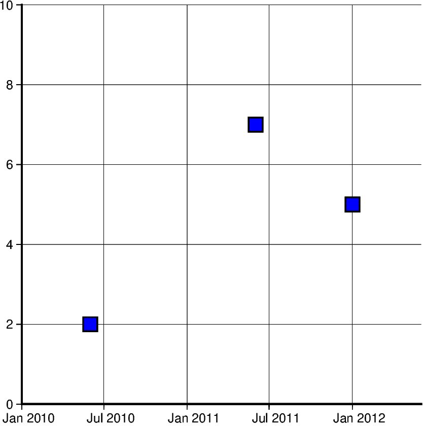
Out:
<IPython.core.display.Image object>
Generating an automatic region
Another way of creating charts involving datetime data can be done
by automatically generating the region of the plot. This can be done
by passing the dataframe to pygmt.info, which will find
maximum and minimum values for each column and create a list
that could be passed as region. Additionally, the spacing argument
can be passed to increase the range past the maximum and minimum
data points.
data = [
    ["20200712", 1000],
    ["20200714", 1235],
    ["20200716", 1336],
    ["20200719", 1176],
    ["20200721", 1573],
    ["20200724", 1893],
    ["20200729", 1634],
]
df = pd.DataFrame(data, columns=["Date", "Score"])
df.Date = pd.to_datetime(df["Date"], format="%Y%m%d")

fig = pygmt.Figure()
region = pygmt.info(
    table=df[["Date", "Score"]], per_column=True, spacing=(700, 700), coltypes="T"
)

fig.plot(
    region=region,
    projection="X15c/10c",
    frame=["WSen", "afg"],
    x=df.Date,
    y=df.Score,
    style="c0.4c",
    pen="1p",
    color="green3",
)

fig.show()
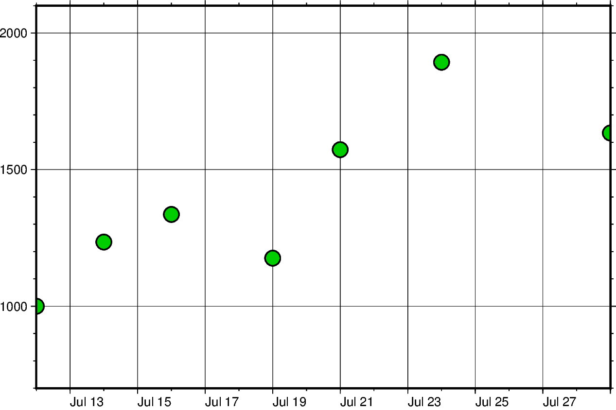
Out:
<IPython.core.display.Image object>
Setting Primary and Secondary Time Axes
This example focuses on labeling the axes and setting intervals
at which the labels are expected to appear. All of these modifications
are added to the frame parameter and each item in that list modifies
a specific section of the plot.
Starting off with WS, adding this string means that only
Western/Left (W) and Southern/Bottom (S) borders of
the plot will be shown. For more information on this, please
refer to frame instructions.
The other important item in the frame list is
"sxa1Of1D". This string modifies the secondary
labeling (s) of the x-axis (x). Specifically,
it sets the main annotation and major tick spacing interval
to one month (a1O) (capital letter o, not zero). Additionally,
it sets the minor tick spacing interval to 1 day (f1D).
The labeling of this axis can be modified by setting
FORMAT_DATE_MAP to ‘o’ to use the month’s
name instead of its number. More information about configuring
date formats can be found on the
official GMT documentation page.
x = pd.date_range("2013-05-02", periods=10, freq="2D")
y = [4, 5, 6, 8, 9, 5, 8, 9, 4, 2]

fig = pygmt.Figure()
with pygmt.config(FORMAT_DATE_MAP="o"):
    fig.plot(
        projection="X15c/10c",
        region=[datetime.datetime(2013, 5, 1), datetime.datetime(2013, 5, 25), 0, 10],
        frame=["WS", "sxa1Of1D", "pxa5d", "sy+lLength", "pya1+ucm"],
        x=x,
        y=y,
        style="c0.4c",
        pen="1p",
        color="green3",
    )

fig.show()
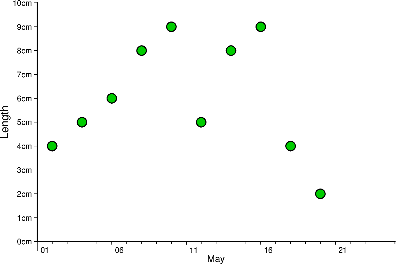
Out:
<IPython.core.display.Image object>
The same concept shown above can be applied to smaller as well as larger intervals. In this example, data is plotted for different times throughout two days. Primary x-axis labels are modified to repeat every 6 hours and secondary x-axis label repeats every day and shows the day of the week.
Another notable mention in this example is setting FORMAT_CLOCK_MAP to “-hhAM” which specifies the format used for time. In this case, leading zeros are removed using (-), and only hours are displayed. Additionally, an AM/PM system is being used instead of a 24-hour system. More information about configuring time formats can be found on the official GMT documentation page.
x = pd.date_range("2021-04-15", periods=8, freq="6H")
y = [2, 5, 3, 1, 5, 7, 9, 6]

fig = pygmt.Figure()
with pygmt.config(FORMAT_CLOCK_MAP="-hhAM"):
    fig.plot(
        projection="X15c/10c",
        region=[
            datetime.datetime(2021, 4, 14, 23, 0, 0),
            datetime.datetime(2021, 4, 17),
            0,
            10,
        ],
        frame=["WS", "sxa1K", "pxa6H", "sy+lSpeed", "pya1+ukm/h"],
        x=x,
        y=y,
        style="n0.4c",
        pen="1p",
        color="lightseagreen",
    )
fig.show()
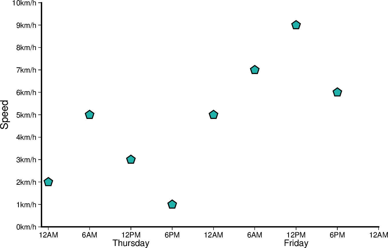
Out:
<IPython.core.display.Image object>
Total running time of the script: ( 0 minutes 9.404 seconds)