Note
Go to the end to download the full example code.
Plotting data points
GMT shines when it comes to plotting data on a map. We can use some sample data
that is packaged with GMT to try this out. PyGMT provides access to these
datasets through the pygmt.datasets package. If you don’t have the data
files already, they are automatically downloaded and saved to a cache directory
the first time you use them (usually ~/.gmt/cache).
import io

import pygmt
from pygmt.params import Position
For example, let’s load the sample dataset of tsunami generating earthquakes
around Japan using pygmt.datasets.load_sample_data.
The data are loaded as a pandas.DataFrame.
data = pygmt.datasets.load_sample_data(name="japan_quakes")
data.head()
Set the region for the plot to be slightly larger than the data bounds.
region = [
    data.longitude.min() - 1,
    data.longitude.max() + 1,
    data.latitude.min() - 1,
    data.latitude.max() + 1,
]
region
[np.float64(131.29), np.float64(150.89), np.float64(34.02), np.float64(50.77)]
We’ll use the pygmt.Figure.plot method to plot circles on the
earthquake epicenters.
fig = pygmt.Figure()
fig.basemap(region=region, projection="M15c", frame=True)
fig.coast(land="black", water="skyblue")
fig.plot(x=data.longitude, y=data.latitude, style="c0.3c", fill="white", pen="black")
fig.show()
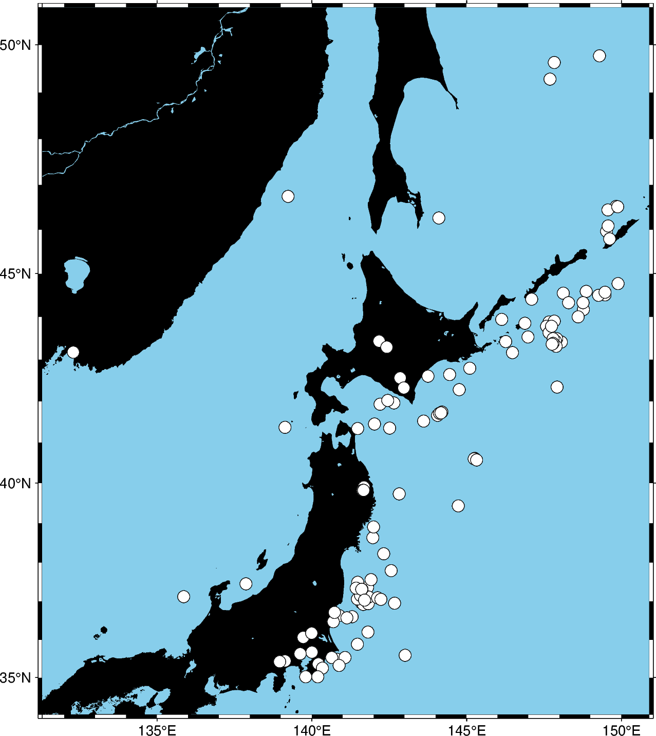
We used the style c0.3c which means “circles with a diameter of 0.3
centimeters”. The pen parameter controls the outline of the symbols and
the fill parameter controls the fill.
We can map the size of the circles to the earthquake magnitude by passing an
array to the size parameter. Because the magnitude is on a logarithmic
scale, it helps to show the differences by scaling the values using a power
law.
A legend for the size of the circles can not be added automatically. But users can
create an io.StringIO object, which can be passed to the spec parameter
of pygmt.Figure.legend. For details on creating legends, see the tutorial
multiple-column legend.
fig = pygmt.Figure()
fig.basemap(region=region, projection="M15c", frame=True)
fig.coast(land="black", water="skyblue")
fig.plot(
    x=data.longitude,
    y=data.latitude,
    size=0.02 * (2**data.magnitude),
    style="cc",
    fill="white",
    pen="black",
)
legend = io.StringIO(
    "\n".join(f"S 0.4 c {0.02 * 2**m:.2f} - 1p 1 Mw {m}" for m in [3, 4, 5])
)
fig.legend(spec=legend, position=Position("BR", offset=0.2), line_spacing=2.0, box=True)
fig.show()
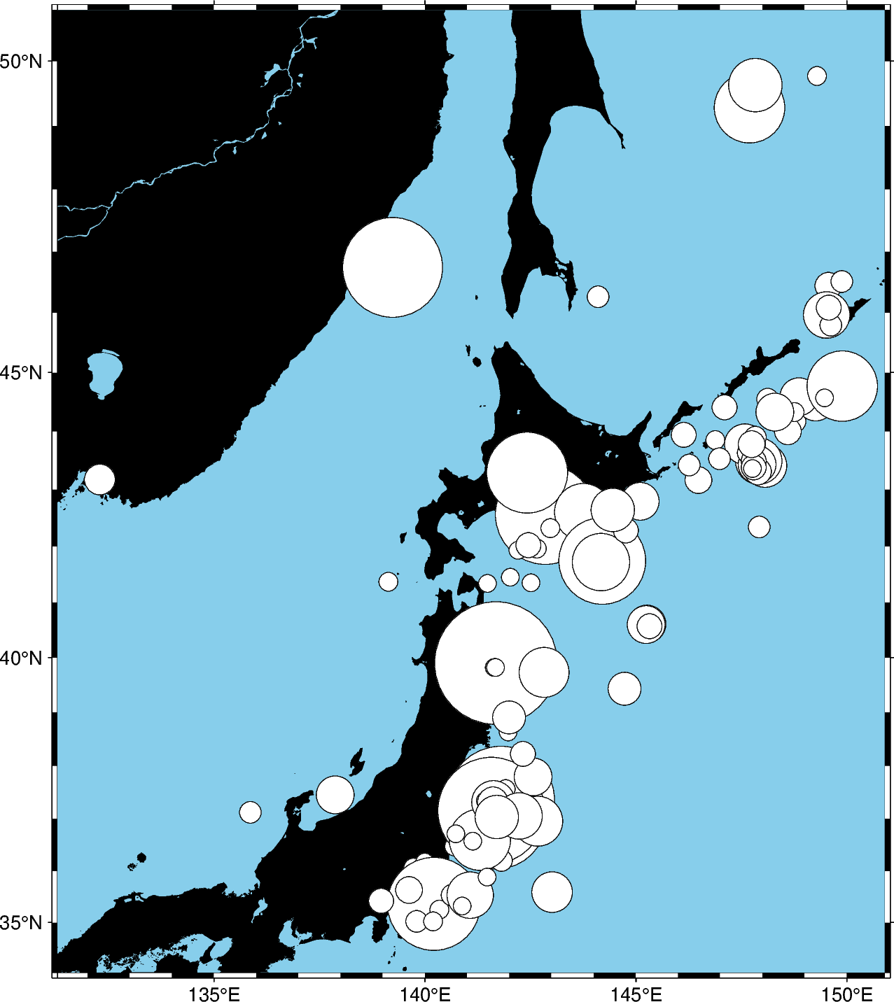
Notice that we didn’t include the size in the style parameter this time,
just the symbol c (circles) and the unit c (centimeters). So in
this case, the size will be interpreted as being in centimeters.
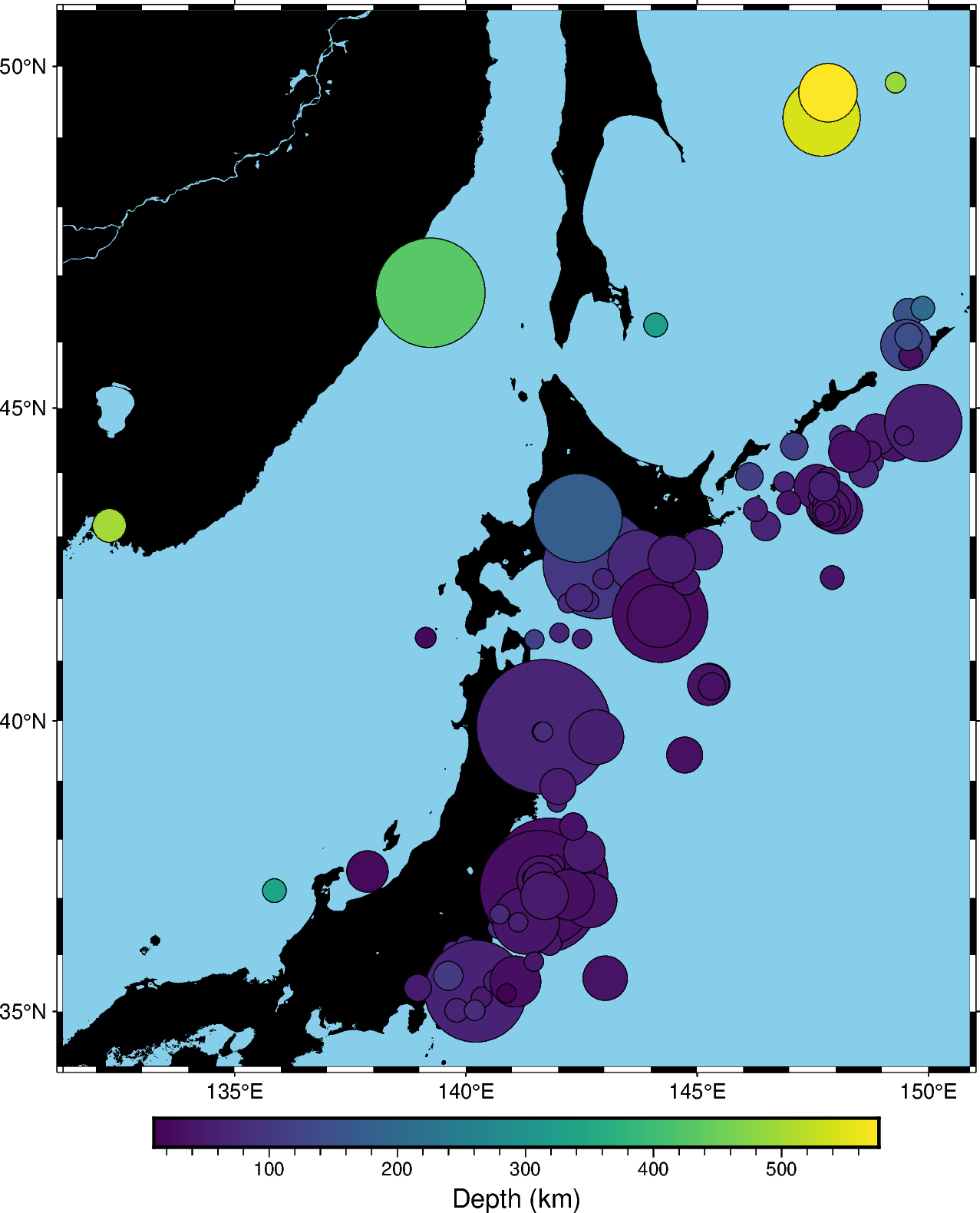
We can also map the colors of the markers to the depths by passing an array
to the fill parameter and providing a colormap name (cmap). We can
even use the new matplotlib colormap “viridis”. Here, we first create a
continuous colormap ranging from the minimum depth to the maximum depth of
the earthquakes using pygmt.makecpt, then set cmap=True in
pygmt.Figure.plot to use the colormap. At the end of the plot, we
also plot a colorbar showing the colormap used in the plot.
fig = pygmt.Figure()
fig.basemap(region=region, projection="M15c", frame=True)
fig.coast(land="black", water="skyblue")
pygmt.makecpt(
    cmap="matplotlib/viridis", series=[data.depth_km.min(), data.depth_km.max()]
)
fig.plot(
    x=data.longitude,
    y=data.latitude,
    size=0.02 * 2**data.magnitude,
    fill=data.depth_km,
    cmap=True,
    style="cc",
    pen="black",
)
fig.colorbar(frame="xaf+lDepth (km)")
fig.legend(spec=legend, position=Position("BR", offset=0.2), line_spacing=2.0, box=True)
fig.show()
Total running time of the script: (0 minutes 0.776 seconds)