Note
Go to the end to download the full example code.
Rose diagram
The pygmt.Figure.rose method can plot windrose diagrams or polar
histograms.
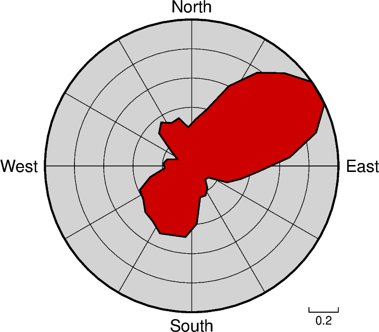
import pygmt
from pygmt.params import Axis, Frame

# Load sample compilation of fracture lengths and azimuth as
# hypothetically digitized from geological maps
data = pygmt.datasets.load_sample_data(name="fractures")

fig = pygmt.Figure()

fig.rose(
    # use columns of the sample dataset as input for the length and azimuth
    # parameters
    length=data.length,
    azimuth=data.azimuth,
    # specify the "region" of interest in the (r,azimuth) space
    # [r0, r1, az0, az1], here, r0 is 0 and r1 is 1, for azimuth, az0 is 0 and
    # az1 is 360 which means we plot a full circle between 0 and 360 degrees
    region=[0, 1, 0, 360],
    # set the diameter of the rose diagram to 7.5 cm
    diameter="7.5c",
    # define the sector width in degrees, we append +r here to draw a rose
    # diagram instead of a sector diagram
    sector="10+r",
    # normalize bin counts by the largest value so all bin counts range from
    # 0 to 1
    norm=True,
    # use red3 as color fill for the sectors
    fill="red3",
    # define the frame with gridlines every 0.2 length unit in radial direction
    # and every 30 degrees in azimuthal direction, set background color to lightgray
    frame=Frame(xaxis=Axis(grid=0.2), yaxis=Axis(grid=30), fill="lightgray"),
    # use a pen size of 1p to draw the outlines
    pen="1p",
)

fig.show()
Total running time of the script: (0 minutes 0.129 seconds)