Note
Go to the end to download the full example code.
Cartesian histograms
Cartesian histograms can be generated using the pygmt.Figure.histogram method.
In this tutorial, different histogram related aspects are addressed:
Using vertical and horizontal bars
Using stair-steps
Showing counts and frequency percent
Adding annotations to the bars
Showing cumulative values
Using color and pattern as fill for the bars
Using overlaid, stacked, and grouped bars
Import the required packages
Generate random data from a normal distribution:
rng = np.random.default_rng(seed=100)

# Mean of distribution
mean = 100
# Standard deviation of distribution
stddev = 20

# Create two data sets
data01 = rng.normal(loc=mean, scale=stddev, size=42)
data02 = rng.normal(loc=mean, scale=stddev * 2, size=42)
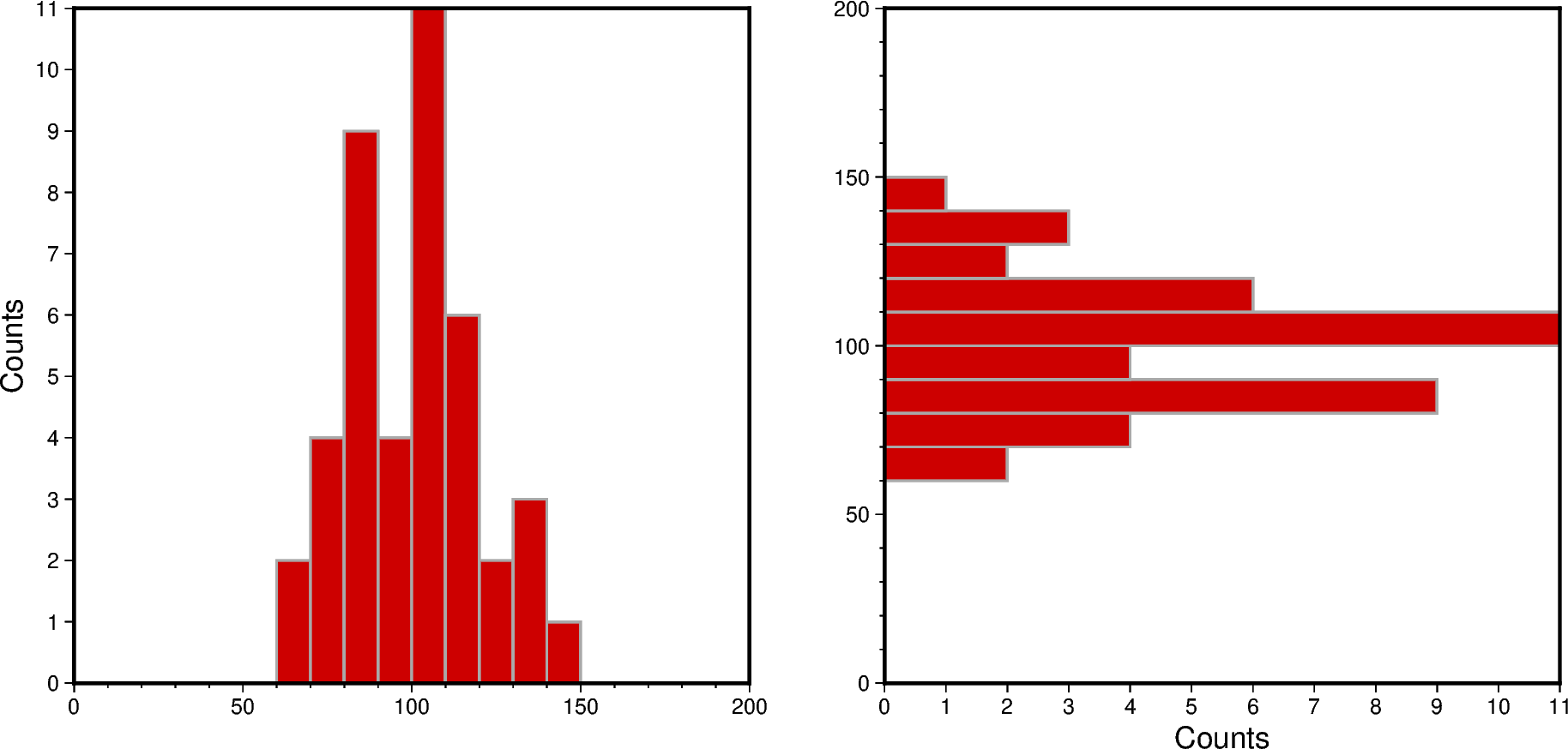
Vertical and horizontal bars
To define the width of the bins, the series parameter has to be specified. The
bars can be filled via the fill parameter with either a color or a pattern (see
later in this tutorial). Use the pen parameter to adjust width, color, and style
of the outlines. By default, a histogram with vertical bars is created. Horizontal
bars can be achieved via horizontal=True.
fig = pygmt.Figure()

# Create histogram for data01 with vertical bars
fig.histogram(
    # Define the plot range as a list of xmin, xmax, ymin, ymax
    # Let ymin and ymax determined automatically by setting both to the same value
    region=[0, 200, 0, 0],
    projection="X10c",  # Cartesian projection with a width of 10 centimeters
    # Add frame, annotations ("a"), ticks ("f"), and y-axis label ("+l") "Counts"; the
    # numbers give the steps of annotations and ticks
    frame=Frame(
        axes="WStr",
        xaxis=Axis(annot=True, tick=10),
        yaxis=Axis(annot=1, tick=1, label="Counts"),
    ),
    data=data01,
    # Set the bin width via the "series" parameter
    series=10,
    # Fill the bars with color "red3"
    fill="red3",
    # Draw a 1-point thick, solid outline in "darkgray" around the bars
    pen="1p,darkgray,solid",
    # Choose counts via the "histtype" parameter
    histtype=0,
)

# Shift plot origin by the figure width ("w") plus 2 centimeters to the right
fig.shift_origin(xshift="w+2c")

# Create histogram for data01 with horizontal bars
fig.histogram(
    region=[0, 200, 0, 0],
    projection="X10c",
    frame=Frame(
        axes="WStr",
        xaxis=Axis(annot=True, tick=10),
        yaxis=Axis(annot=1, tick=1, label="Counts"),
    ),
    data=data01,
    series=10,
    fill="red3",
    pen="1p,darkgray,solid",
    histtype=0,
    # Use horizontal bars. Note that the x- and y-axes are flipped, with the x-axis
    # plotted vertically and the y-axis plotted horizontally.
    horizontal=True,
)

fig.show()
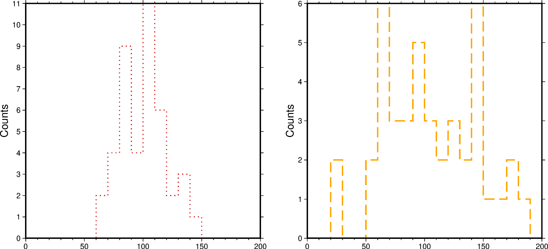
Stair-steps
A stair-step diagram can be created by setting stairs=True. Then only the
outer outlines of the bars are drawn, and no internal bars are visible.
fig = pygmt.Figure()

# Create histogram for data01
fig.histogram(
    region=[0, 200, 0, 0],
    projection="X10c",
    frame=Frame(
        axes="WSne",
        xaxis=Axis(annot=True, tick=10),
        yaxis=Axis(annot=1, tick=1, label="Counts"),
    ),
    data=data01,
    series=10,
    # Draw a 1-point thick, dotted outline in "red3"
    pen="1p,red3,dotted",
    histtype=0,
    # Draw stair-steps in stead of bars
    stairs=True,
)

fig.shift_origin(xshift="w+2c")

# Create histogram for data02
fig.histogram(
    region=[0, 200, 0, 0],
    projection="X10c",
    frame=Frame(
        axes="WSne",
        xaxis=Axis(annot=True, tick=10),
        yaxis=Axis(annot=1, tick=1, label="Counts"),
    ),
    data=data02,
    series=10,
    # Draw a 1.5-point thick, dashed outline in "orange"
    pen="1.5p,orange,dashed",
    histtype=0,
    stairs=True,
)

fig.show()
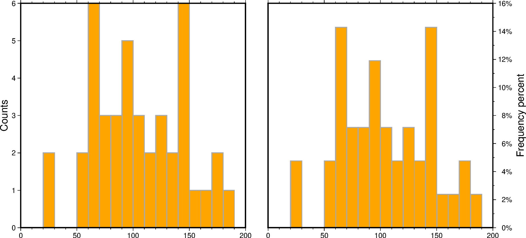
Counts and frequency percent
By default, a histogram showing the counts in each bin is created (histtype=0).
To show the frequency percent set the histtype parameter to 1. For further
options please have a look at the documentation of pygmt.Figure.histogram.
fig = pygmt.Figure()

# Create histogram for data02 showing counts
fig.histogram(
    region=[0, 200, 0, 0],
    projection="X10c",
    frame=Frame(
        axes="WSnr",
        xaxis=Axis(annot=True, tick=10),
        yaxis=Axis(annot=1, tick=1, label="Counts"),
    ),
    data=data02,
    series=10,
    fill="orange",
    pen="1p,darkgray,solid",
    # Choose counts via the "histtype" parameter
    histtype=0,
)

fig.shift_origin(xshift="w+1c")

# Create histogram for data02 showing frequency percent
fig.histogram(
    region=[0, 200, 0, 0],
    projection="X10c",
    # Add suffix % (+u)
    frame=Frame(
        axes="lSnE",
        xaxis=Axis(annot=True, tick=10),
        yaxis=Axis(annot=2, tick=1, unit="%", label="Frequency percent"),
    ),
    data=data02,
    series=10,
    fill="orange",
    pen="1p,darkgray,solid",
    # Choose frequency percent via the "histtype" parameter
    histtype=1,
)

fig.show()
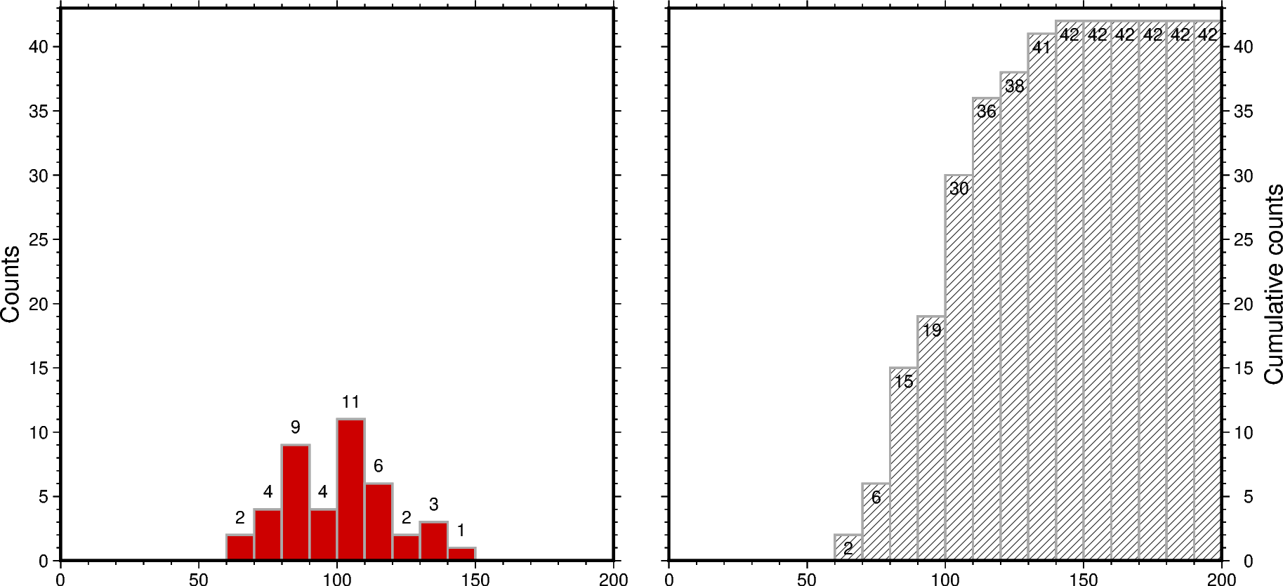
Cumulative values
To create a histogram showing the cumulative values set cumulative=True. Here, the
bars of the cumulative histogram are filled with a pygmt.params.Pattern via
the fill parameter. Annotate each bar with the counts it represents using the
annotate parameter.
fig = pygmt.Figure()

# Create histogram for data01 showing the counts per bin
fig.histogram(
    region=[0, 200, 0, len(data01) + 1],
    projection="X10c",
    frame=Frame(
        axes="WSne",
        xaxis=Axis(annot=True, tick=10),
        yaxis=Axis(annot=5, tick=1, label="Counts"),
    ),
    data=data01,
    series=10,
    fill="red3",
    pen="1p,darkgray,solid",
    histtype=0,
    # Annotate each bar with the counts it represents
    annotate=True,
)

fig.shift_origin(xshift="w+1c")

# Create histogram for data01 showing the cumulative counts
fig.histogram(
    region=[0, 200, 0, len(data01) + 1],
    projection="X10c",
    frame=Frame(
        axes="wSnE",
        xaxis=Axis(annot=True, tick=10),
        yaxis=Axis(annot=5, tick=1, label="Cumulative counts"),
    ),
    data=data01,
    series=10,
    # Fill bars with GMT pattern 8, with white background and black foreground.
    fill=Pattern(8, bgcolor="white", fgcolor="black"),
    pen="1p,darkgray,solid",
    histtype=0,
    # Show cumulative counts
    cumulative=True,
    # Offset ("+o") the label by 10 points in negative y-direction
    annotate="+o-10p",
)

fig.show()
Overlaid bars
Overlaid or overlapping bars can be achieved by plotting two or several histograms,
each for one data set, on top of each other. The legend entry can be specified via
the label parameter.
Limitations of histograms with overlaid bars are:
Mixing of colors or/and patterns
Visually more colors or/and patterns than data sets
Visually a “third histogram” (or more in case of more than two data sets)
fig = pygmt.Figure()

# Create histogram for data01
fig.histogram(
    region=[0, 200, 0, 0],
    projection="X10c",
    frame=Frame(
        axes="WSne",
        xaxis=Axis(annot=True, tick=10),
        yaxis=Axis(annot=1, tick=1, label="Counts"),
    ),
    data=data01,
    series=10,
    fill="red3",
    pen="1p,darkgray,solid",
    histtype=0,
    # Set legend entry
    label="data01",
)

# Create histogram for data02
# It is plotted on top of the histogram for data01
fig.histogram(
    data=data02,
    series=10,
    # Fill bars with color "orange", use a transparency of 50% ("@50")
    fill="orange@50",
    pen="1p,darkgray,solid",
    histtype=0,
    label="data02",
)

# Add legend
fig.legend()

fig.show()
Stacked bars
Histograms with stacked bars are not directly supported by PyGMT. Thus, before plotting, combined data sets have to be created from the single data sets. Then, stacked bars can be achieved similar to overlaid bars via plotting two or several histograms on top of each other.
Limitations of histograms with stacked bars are:
No common baseline
Partly not directly clear whether overlaid or stacked bars
# Combine the two data sets to one data set
data_merge = np.concatenate((data01, data02), axis=None)

fig = pygmt.Figure()

# Create histogram for data02 by using the combined data set
fig.histogram(
    region=[0, 200, 0, 0],
    projection="X10c",
    frame=Frame(
        axes="WSne",
        xaxis=Axis(annot=True, tick=10),
        yaxis=Axis(annot=1, tick=1, label="Counts"),
    ),
    data=data_merge,
    series=10,
    fill="orange",
    pen="1p,darkgray,solid",
    histtype=0,
    # The combined data set appears in the final histogram visually as data set data02
    label="data02",
)

# Create histogram for data01
# It is plotted on top of the histogram for data02
fig.histogram(
    data=data01,
    series=10,
    fill="red3",
    pen="1p,darkgray,solid",
    histtype=0,
    label="data01",
)

# Add legend
fig.legend()

fig.show()
Grouped bars
By setting the bar_width parameter in respect to the values passed to the
series parameter histograms with grouped bars can be created.
Limitations of histograms with grouped bars are:
Careful setting width and position of the bars in respect to the bin width
Difficult to see the variations of the single data sets
# Width used for binning the data
binwidth = 10

fig = pygmt.Figure()

# Create histogram for data01
fig.histogram(
    region=[0, 200, 0, 0],
    projection="X10c",
    frame=Frame(
        axes="WSne",
        xaxis=Axis(annot=True, tick=10, grid=10),
        yaxis=Axis(annot=1, tick=1, label="Counts"),
    ),
    data=data01,
    series=binwidth,
    fill="red3",
    pen="1p,darkgray,solid",
    histtype=0,
    # Calculate the bar width in respect to the bin width, here for two data sets half
    # of the bin width
    bar_width=binwidth / 2,
    # Offset the bars to align each bar with the left limit of the corresponding bin
    bar_offset=-binwidth / 4,
    label="data01",
)

# Create histogram for data02
fig.histogram(
    data=data02,
    series=binwidth,
    fill="orange",
    pen="1p,darkgray,solid",
    histtype=0,
    bar_width=binwidth / 2,
    bar_offset=binwidth / 4,
    label="data02",
)

# Add legend
fig.legend()

fig.show()
Total running time of the script: (0 minutes 1.269 seconds)