Note
Go to the end to download the full example code.
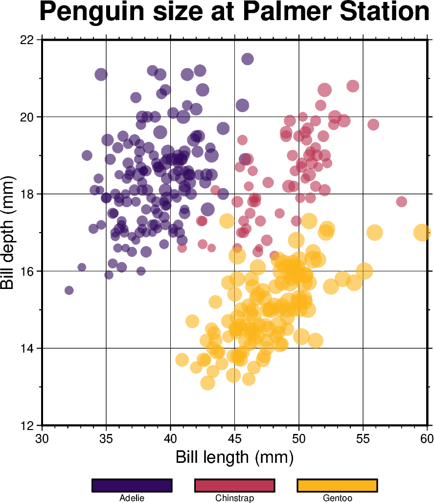
Color points by categories
The pygmt.Figure.plot method can be used to plot symbols which are
color-coded by categories. In the example below, we show how the
Palmer Penguins dataset
can be visualized. Here, we can pass the individual categories included in
the “species” column directly to the fill parameter via
fill=df.species.cat.codes.astype(int). Additionally, we have to set
cmap=True. A desired colormap can be selected via the pygmt.makecpt
function.
import pandas as pd
import pygmt
from pygmt.params import Axis, Frame

# Load sample penguins data
df = pd.read_csv("https://github.com/mwaskom/seaborn-data/raw/master/penguins.csv")

# Convert 'species' column to categorical dtype
# By default, pandas sorts the individual categories in an alphabetical order.
# For a non-alphabetical order, you have to manually adjust the list of
# categories. For handling and manipulating categorical data in pandas,
# have a look at:
# https://pandas.pydata.org/docs/user_guide/categorical.html
df.species = df.species.astype(dtype="category")

# Make a list of the individual categories of the 'species' column
# ['Adelie', 'Chinstrap', 'Gentoo']
# They are (corresponding to the categorical number code) by default in
# alphabetical order and later used for the colorbar annotations
cb_annots = list(df.species.cat.categories)

# Use pygmt.info to get region bounds (xmin, xmax, ymin, ymax)
# The below example will return a numpy array like [30.0, 60.0, 12.0, 22.0]
region = pygmt.info(
    data=df[["bill_length_mm", "bill_depth_mm"]],  # x and y columns
    per_column=True,  # Report the min/max values per column as a numpy array
    # Round the min/max values of the first two columns to the nearest multiple
    # of 3 and 2, respectively
    spacing=(3, 2),
)

# Make a 2-D categorical scatter plot, coloring each of the 3 species
# differently
fig = pygmt.Figure()

# Generate a basemap of 10 cm x 10 cm size
fig.basemap(
    region=region,
    projection="X10c/10c",
    frame=Frame(
        axes="WSen",
        title="Penguin size at Palmer Station",
        xaxis=Axis(annot=True, tick=True, grid=True, label="Bill length (mm)"),
        yaxis=Axis(annot=True, tick=True, grid=True, label="Bill depth (mm)"),
    ),
)

# Define a colormap for three categories, define the range of the
# new discrete CPT using series=(lowest_value, highest_value, interval),
# use color_model="+cAdelie,Chinstrap,Gentoo" to write the discrete color
# palette "inferno" in categorical format and add the species names as
# annotations for the colorbar
pygmt.makecpt(
    cmap="matplotlib/inferno",
    # Use the minimum and maximum of the categorical number code
    # to set the lowest_value and the highest_value of the CPT
    series=(df.species.cat.codes.min(), df.species.cat.codes.max(), 1),
    # Convert ['Adelie', 'Chinstrap', 'Gentoo'] to 'Adelie,Chinstrap,Gentoo'
    color_model="+c" + ",".join(cb_annots),
)

fig.plot(
    # Use bill length and bill depth as x and y data input, respectively
    x=df.bill_length_mm,
    y=df.bill_depth_mm,
    # Vary symbol size according to the body mass, scaled by 7.5e-5
    size=df.body_mass_g * 7.5e-5,
    # Points colored by categorical number code (refers to the species)
    fill=df.species.cat.codes.astype(int),
    # Use colormap created by makecpt
    cmap=True,
    # Do not clip symbols that fall close to the plot bounds
    no_clip=True,
    # Use circles as symbols (the first "c") with diameter in
    # centimeters (the second "c")
    style="cc",
    # Set transparency level for all symbols to deal with overplotting
    transparency=40,
)

# Add colorbar legend
fig.colorbar()

fig.show()
Total running time of the script: (0 minutes 0.324 seconds)